
The short version
- This is one real sheet I wrote and the font SnapFont made from one photo of it. Nothing on this page is a mockup and I did not edit a single letter.
- The sheet is the free 72 box template on plain paper, written with a fine tip Sharpie, photographed on a dark table with my phone.
- The font came back in a few minutes. The letters are mine, the sizes and the baseline came from my own writing, and the spacing is set from the widths on the sheet.
- Some letters I like more than others, and I say which. If you want to see what your own would look like, the sheet is free and takes about 20 minutes.
Why I am showing my own
Every handwriting font site shows you a perfect sample and none of them show you the page it came from. That is the part I care about, because it is the part you will actually do. So here is my sheet, exactly as I photographed it, and here is the font the app built from it. If it looks good, that is the honest result. If a letter looks off, that is the honest result too.
The sheet I wrote
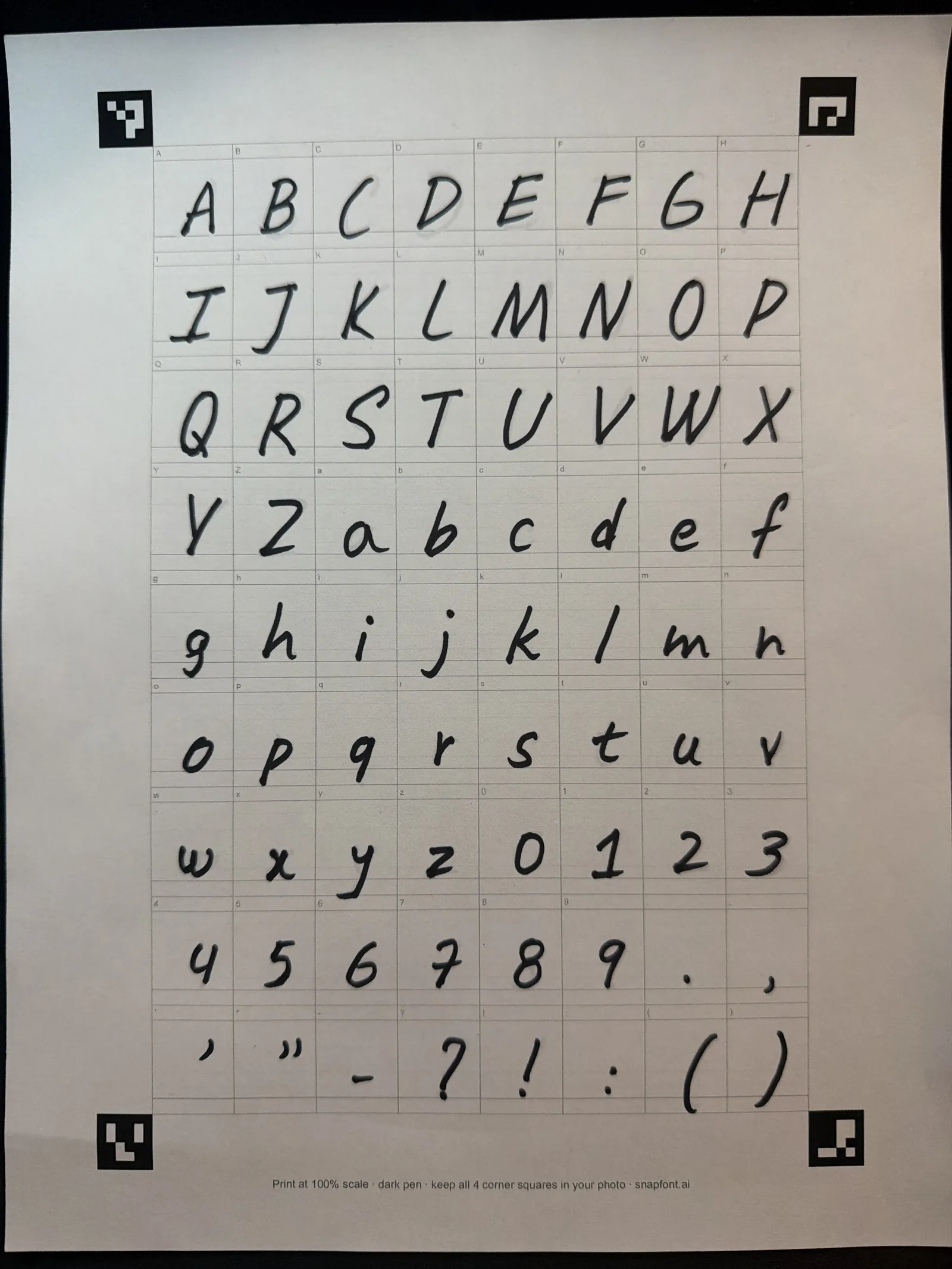
A few things that mattered and that you can see in the picture. The four black squares in the corners are all in the frame; the app uses them to straighten the page, so if one is cut off the photo will not take. The ink is dark and the pen is a medium tip, which is why every stroke is solid. And I wrote over the faint grey letter in each box at about its size, so the capitals are taller than the lowercase and the descenders on g, j, p, q and y hang below the line, the way they do when I write normally.
I did not write carefully. That was the point. I wanted the font to look like a note I would leave on the fridge, not like a signature I practised. You can see my capital I has the bars top and bottom, my g has no loop, and my 7 has no cross. Those are all in the font.
The font it made
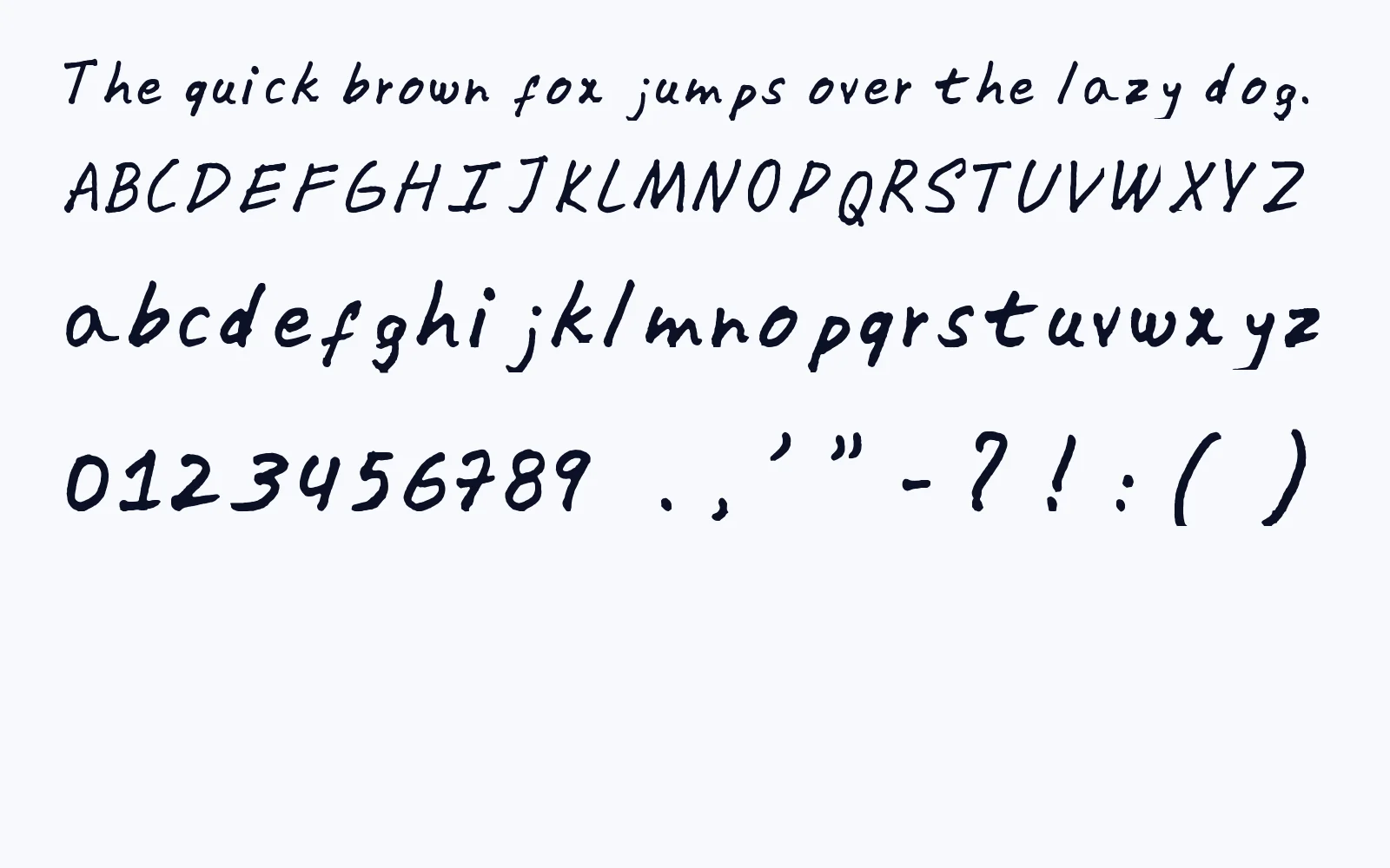
This is the TTF the app handed back, typed out. It is the same file I installed on my iPhone. The app cut each letter out of its box, traced the ink, and worked out three things from the sheet itself: how tall each letter should be, where it sits on the line, and how much room it takes up. It never asked me to set any of that.
Because those sizes came from my own page, the capitals in the specimen are the right height next to the lowercase, and the descenders drop the right amount. That is the part that usually looks wrong in handwriting fonts and it is the part I spent the most time on in the app.
The same letters, sheet next to font
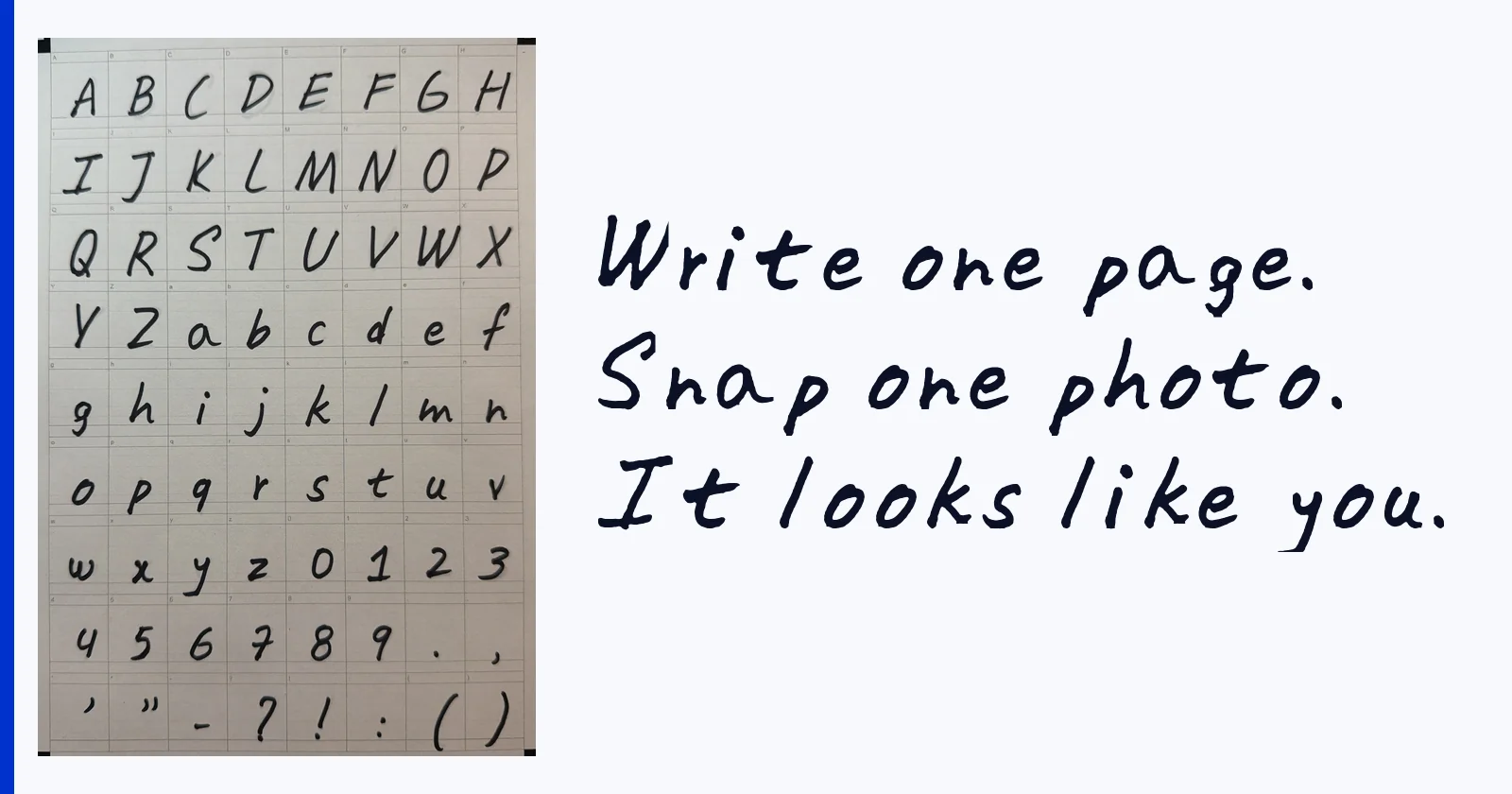
Put them next to each other and the match is easy to check. The capital S leans the same way in both. The g is the plain open g I actually write, not the schoolbook one with the loop, because the app does not have opinions about what a g should look like. It only has mine.
What I would change on my next sheet
- Spacing. My font sits a little airy. That is not the app being wrong; I write with gaps, and the widths of the boxes on the sheet became the widths of the letters. If you want a tighter font, write your letters a touch closer to the box edges.
- Zero and capital O. Mine are nearly the same shape. That is true of my handwriting too, but on a sheet it is worth making the zero narrower on purpose so numbers read clearly.
- The quotation marks. I wrote them small and they came out small. Punctuation gets less attention than letters and it shows. Next time I would write every mark as big as its box allows.
- Pressure. A few strokes are a touch lighter where the marker skated, and a light stroke traces thinner. A fresh marker and a steady hand fix that.
None of these needed a redo. If one did, the app lets you re-capture a single letter rather than the whole page, which is what I would use for the zero.
See what yours looks like
The sheet is free and does not need the app to print: download the template, write your 72 letters with a dark pen, and take one photo with all four corner squares in the frame. The full walkthrough with pen and lighting advice is in the one photo guide. On iPhone the font installs system-wide with one more tap; on Android you export the TTF and use it in apps that accept fonts.